Don’t they annoy you?
Those popups you see everywhere…
“Get more traffic with my free eBook”
“Win more business with this proven formula”
“Are you sure you don’t want this free [insert gift here]”
Popups on your site have a way of polarizing people. You either love them or hate them.
But usually, once you realize how ridiculously effective they are at growing your email list you usually come to the party.
After all, if people are deciding to opt in… The popup must not be annoying them that much. Right?
Love them or hate them, popups are a regular topic of conversation when it comes to list building.
And everyone wants to know the secrets behind growing a big list, because when it comes to running an online business – subscribers and relationships are all that matter.
Most high-converting list building strategies such as content upgrades and guest blogging require a significant amount of work up front. Basically, to get any results you need to create NEW content.
Popups on the other hand are leveraging the traffic you are ALREADY getting to your site.
Today I want to talk about two types of popups we use here at Blogger Sidekick that have skyrocketed our list growth on auto-pilot, without publishing any new content.
Popup on arrival
The popup on arrival is just as it sounds… Someone arrives at your website, and a popup shows in a predetermined amount of time asking them to take action.
The trick for optimizing conversions with the on arrival popup is to wait an appropriate amount of time before asking someone to opt in.
You COULD ask someone to opt in almost immediately as they visit your site. But at this stage, they probably don’t have a clue who you are and are unlikely to take the bait.
On the flip side, if you wait until they have experienced more of your site before asking them to opt in, your conversions will be significantly higher. For example, you may choose to program the popup to work only after they have scrolled down a certain percentage of your page, OR once they have visited multiple pages on your site. (Don’t worry about how this works for now, I’ll provide a step-by-step later in the post)
Our popup on arrival here at Blogger Sidekick is set to appear after 30 seconds if a visitor has seen at least 2 pages of the site. Once they see the popup we then don’t show it again for 60 days.
Our popup on arrival converts at 21%… That means that 21% of all the people that meet the required conditions above decide to take the bait and sign up for our email list. That is a huge chunk of potential customers that wouldn’t be on our list otherwise.
Exit-intent popup
The second type of popup I’d like to talk about is the exit-intent popup. This type of popup only appears if a visitor is hovering their mouse over the exit icon in their browser, or signalling they are about to leave your site in some other way.
The exit-intent popup here at Blogger Sidekick converts at 16%… It’s expected that it would be less than the on arrival popup because the visitor is about to leave your site.
Isn’t that crazy though?
16% of people that are about to leave the site and potentially NEVER come back are all of a sudden on our email list.
That is the power of these popups, and why you can’t ignore their value.
How do you get popups working on your site?
Ok, so popups are great for list building… You got it.
But how do you actually get them working on your site, do you need to hire a developer or something?
This is a question I always get asked, and it is what inspired me to put together this blog post.
The great news is that the world of popups has come a long way in recent times. There are a whole bunch of popup WordPress plugins available that will help you create clean looking popups in minutes, over and over again for your site.
I’ve put together a list of 10 of the best options I could find that will help you create popups in no time, and explode your list growth.
Plus, if you scroll down below the list there is a step-by-step lesson on how to setup both on-arrival, and exit-intent popups using LeadBoxes (by LeadPages).
Note: I’ve gathered together the best popup WordPress plugins, but if you don’t run your site on the WordPress platform most of them work on all sites.
Disclaimer: I will do my best to give an honest and fair breakdown of all the available tools, so you can make an educated decision on what works best for your context. But to be up front and honest, if you click on some of the links below and purchase, I will get a small affiliate commission. (It’s a win-win so why not right!)
Does this order mean anything?… Yea kind of.
For those of you that don’t have time to read this whole post I’ve tried to include my favorite options at the top so you can make a quick decision about what will work for you.
1. LeadBoxes by LeadPages
LeadPages is more than just a popup WordPress plugin…
As a member you can access an array of tools and analytics;
- LeadPages: Easy-made landing pages in minutes with a huge library of pre-set templates
- LeadBoxes: This is the money-maker when it comes to creating popups quickly and easily for your site, including on-arrival and exit intent popups
- LeadDigits: Capture email addresses and phone numbers through SMS text messaging
- LeadLinks: This allows users to subscribe to your list by clicking a unique link – no opt-in or additional information needed
- Analytics and split testing: Make sure your popups are optimized for results with in-depth analytics and testing options
What I like about LeadPages as a list building option is that it’s really easy to use. Anyone can edit their popup template using the intuitive visual editor. Plus, it looks nice, clean and well designed.
Its number one point of difference over the other popup options in this article is that it is an all-in-one lead generation software solution. Compared to the others that focus purely on list building forms, rather than entire landing pages. (This makes it a slightly higher price of course starting at US$25 a month)
Also, LeadBoxes enables you to create a custom popup on your blog that initiates when someone clicks a link… This is awesome for using content upgrades on your blog posts like this;
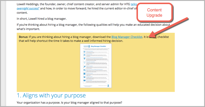
One thing LeadPages lacks is access to multiple templates… Unlike its in-depth landing page library, there is only one basic popup template to work with. But you can customize all of the elements within that template to make it your own.
So if you’re looking for a solution that is super customizable, this may not be for you.
But if you’re happy with accepting the design options already available within the software, you’ll be ok with this.
What does it look like?
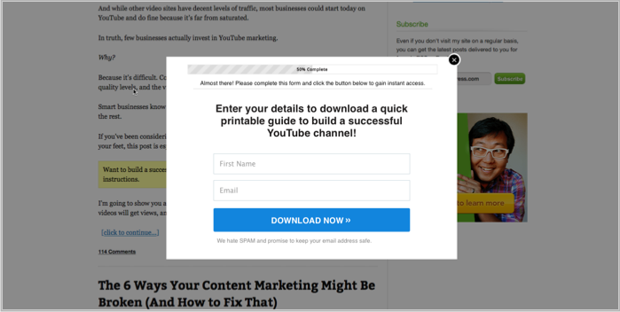
LeadBoxes are the go-to popup solution for lots of the marketers I respect…
Here it is in action on Neil Patel’s Quick Sprout blog;
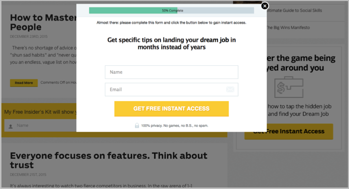
And on Ramit Sethi’s I Will Teach You To Be Rich;
If you want a step-by-step instruction for setting up popups on your blog using LeadPages click here.
2. OptinMonster
OptinMonster is another favourite amongst some big-time marketers….
Just like LeadPages you can really easily create exit intent and on-arrival popups without design experience.
On top of popups you can also create floating bars, slide-ins, sidebar forms and other email capture forms with OptinMonster.
A couple of things it does better than LeadBoxes is provide page level targeting, meaning you can tailor your message for specific pages on your site and its forms are more flexible in their design and execution.
It’s also a lot more affordable than LeadPages, starting at US$49 a year…
What does it look like?
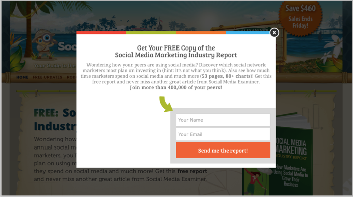
Here is an OptinMonster popup in action on Social Media Examiner;
3. Thrive Leads
Thrive Leads allows you to create popup forms, sidebar forms, header bars, slide ins, in-post forms and lead links… Plus you can target them to specific pages on your site just like with OptinMonster. This targeting feature is massive when it comes to creating super-specific lead magnets related to your content.
You can initiate the popup based on a bunch of cool triggers such as exit intent, scroll depth, page load, and time on site.
If you want to get your hands on Thrive Leads it is only a one off payment of US$59, rather than the recurring investment required with the previously mentioned tools.
If I was to pick a deterrent from signing up for Thrive Leads it would have to go back to the “all-in-one” thing again… It is purely a list building tool that doesn’t provide landing page functionality (Although its parent brand Thrive Themes has a landing page option). Plus, there is whispers the customer support is a little TOO relaxed.
But if these two things aren’t a big deal to you then this is a great option.
What does it look like?
Thrive Leads is still kind of an unknown tool to many marketers, but one guy who has seen some great results is Robbie Richards.
Here is the clean looking Thrive Leads popup featured on RobbieRichards.com;
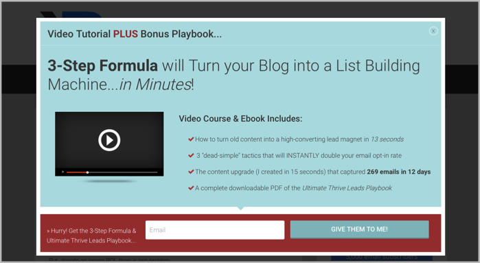
Robbie increased his list by 1,124 emails in 60 days using this popup software.
If you are seriously considering Thrive Leads as a popup WordPress plugin, this demo video from Ashley Faulkes (a fellow Aussie) over at Mad Lemmings is well worth a watch;
4. SumoMe
SumoMe isn’t just a popup WordPress plugin…
It is packed full of a ton of other great site additions that will help you grow your email list and optimize your online marketing strategy.
Here is a quick run down of just some of what SumoMe has to offer;
- Heat mapping to see where your site visitors are active on your web pages
- Social sharing plugin (which we use here at Blogger Sidekick) to boost social shares on your site pages
- Network of over 150,000 sites that can send more traffic your way through their ‘Discover’ feature
- Image sharer, making it easy for users to share images directly from your site to social media
- Welcome mat and smart bar to capture email addresses at the top of your page when visitors first arrive on your site
- Scroll box and list builder popups… These are the ones we want to focus on for this post.
The cool thing about SumoMe is that it’s totally free (well for the most part anyway).
All you need to do to setup many of the features I mention above is head to the SumoMe website and register your site. Once you’ve done that, a little SumoMe logo will appear on your own site where you can access everything you need.
It looks like this;
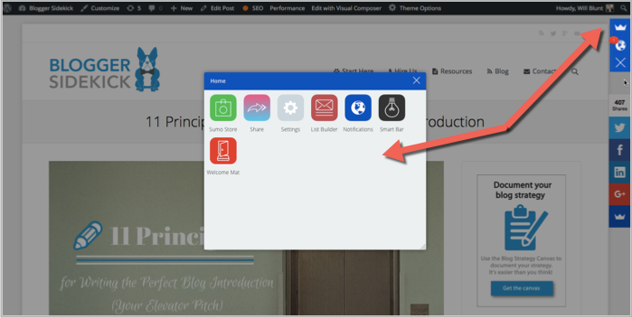
Much like the other popup plugins I’ve mentioned, you can set a timer on your popup and choose specific pages for it to appear on.
What does it look like?
The free version of the list builder popups with SumoMe has a default template which looks nice and clean from a design perspective.
Here’s what it looks like on Neville Medhora’s blog Kopywriting Kourse;
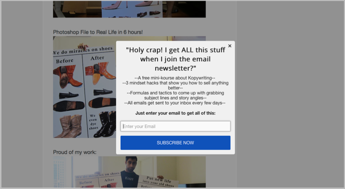
If you’re feeling fancy you can buy several more advanced popup templates for a minimal fee, or sign up for their monthly package and get access to everything that SumoMe offers!
5. Ninja Popups
Ninja Popups was the creation of the developers over at Code Canyon… (Now known as Envato Market)
Envato Market is the “largest script and code network on the internet”… Basically whatever you need for your website, you can get it at Envato Market.
Plugins, themes… plus a whole bunch of stuff I don’t know how to pronounce. (We got our site theme from there, it’s called the7)
Ninja Popups lets you build some pretty nice looking lightbox popups with over 65 popup “themes”, partnered with page level targeting, content hiding functionality, full customization and some much needed analytics.
Plus, you can control when your popup shows, get additional opt-in bars for your site and even ask for social shares instead of an email address.
With over 1,100 reviews on Envato Market, Ninja Popups is still sporting an impressive 4.3 stars out of 5 and is only US$25.
What does it look like?
One of the coolest things about Ninja Popups is its 70+ popup animations… That look like this;
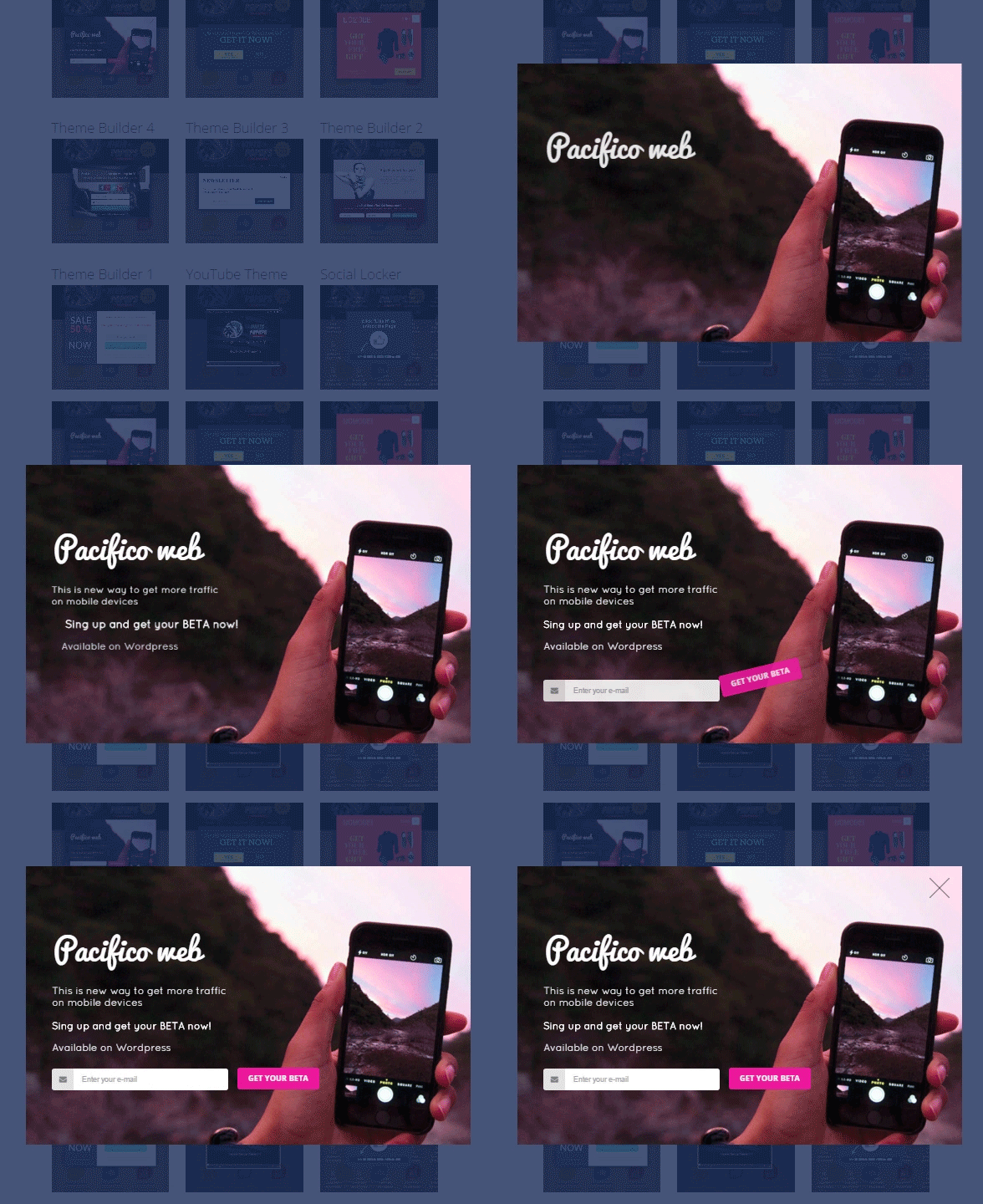
(This is a big point of difference)
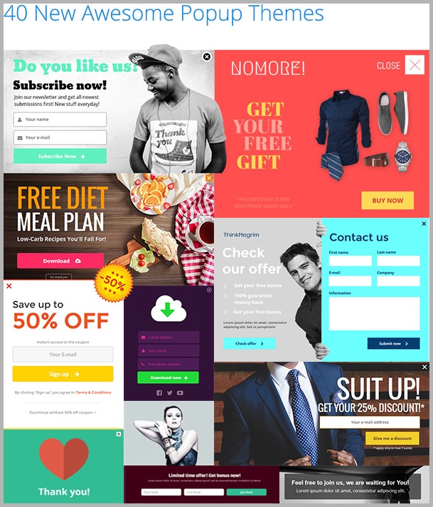
And here’s a sneak peak into some of the 65 popup themes;
6. Bloom
Bloom is an off shoot of the well-known WordPress theme developer Elegant Themes.
Being backed by a slick theme developer means that Bloom is visually appealing and cleanly designed.
Its main point of difference is the almost ridiculous amount of templates available for creating popups.
Bloom has in excess of 100 high quality, well-designed popup templates for you to choose from. Each template is customizable so it can fit with your website’s brand and style.
It’s not just popups either – Bloom has fly-ins, a widget area opt-in form as well as in-text opt-in boxes
There is also some great options when it comes to WHEN your popups show up with Bloom…
You can choose time delay, page scroll, purchase behavior, inactivity and others.
As a top up for paying the US$89 a year for Bloom you get access to 80+ premium WordPress themes and some other great plugins.
What does it look like?
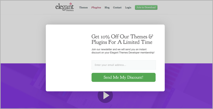
Here is an example of the Bloom popup on the Elegant Themes website (of course this is a super-basic example);
7. Icegram
You won’t find another free popup plugin with as many options as Icegram…
That’s what makes it such a viable option for those on a budget.
On top of list building popups you can also build top bars and messenger popups.
Creating a popup with Icegram is a little trickier than with some of the other plugins mentioned because you are doing it with the WordPress visual editor. (Which as we know can be clunky at times)
Plus there are some limitations on changing colors and adding certain elements to the pre-set templates. So unless you are totally happy with the style you are given, you can’t adapt it to your brand.
If you want to trigger your Icegram popups based on behavioral triggers and geo-targeting, or if you want to use the tool for creating other opt-in forms you’ll start to pay a small fee each time. But it’s minimal compared to the other options.. Making this a great starter popup plugin.
What does it look like?
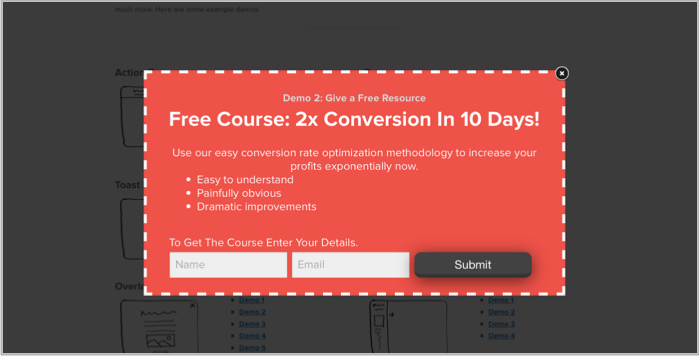
Icegram has 6 potential popup styles to choose from…
Here’s one;
And another…
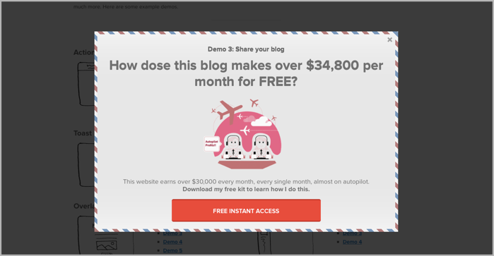
As you can see, these two examples are quite different in style and design. In fact, all 6 of the pre-set templates are extremely different… This means there is a good chance you will find one that fits with your brand.
8. PopUp Domination
(Whoops… PopUp domination isn’t a WordPress plugin, but it’s definitely worthy of a mention in this list)
Instead of slowing down your site with a WordPress plugin, PopUp Domination hosts everything for you, which has an immediate effect on speed and reliability. Plus, there’s less chance it will muck around with your site’s code.
Much like the other options in this list, PopUp Domination gives you the option to split test popups and track results with analytics. It also allows you to create “Click for popups” much like LeadBoxes, exit-intent popups and you can use it on unlimited websites (including your clients).
Its pricing ranges from US$9 a month right through to $US99 a month depending on your appetite for customization and flexibility. But again, this is purely a popups play… so if you’re looking for an all-in-one list building or marketing solution this probably isn’t the best choice.
It has a big range of themes and design customization, but in my opinion the design elements don’t have the same edge as the other alternatives offered above.
What does it look like?
Perhaps the coolest feature with PopUp Domination is the ‘Countdown Themes’ like the one below…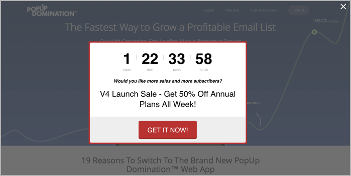
The countdown timer is a great way to create urgency and influence your visitors to take action.
9. WordPress PopUp
The ‘WordPress Popup‘ plugin has over 50,000 active users… which makes it one of the more popular options in this list.
But it’s pretty old school and limited compared to some of the others. (Popups have come a long way since this bad boy was first created)
If you want to get the most out of this plugin by including customization and templates it will require a small investment of US$19.
However, if all you need is a basic popup that looks decent and gets the job done – this solution will scratch your itch in the short term.
Unlike some of the other plugins I’ve mentioned, this one requires you to create your popups using the WordPress visual editor. Sure it’s familiar, but it doesn’t give you the scope to fully customize like most of the drag and drop builders do.
It almost feels silly to mention it because all of them seem to have it, but you can edit the conditions for which your popup displays based on time, location, clicks and a few other triggers.
The PRO version is a little more interesting when it comes to customization, but in my opinion it’s still a shadow of the other options out there.
What does it look like?
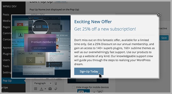
As you can see the WordPress popup is pretty basic in its look;
10. Pippity
Pippity was sitting at number 10 in this list… Until I discovered JustUno thanks to a comment below from Grant Thomas.
Grant works for JustUno, so at first I was a little sceptical about taking his advice. But I did some digging around and discovered that it’s a pretty killer option that I totally missed.
That’s why I decided to add it to the post at number 10!
10. JustUno
Justuno is another popup WordPress plugin that you can use for list building, gated content, contests, and ecommerce promotions.
If design is important to you then Justuno may be a good fit. The platform comes with a complete design canvas that allows you to customize your popups, side bars, header/footer bars, and exit popups to match your website’s look and feel.
Justuno also comes with smart targeting and segmentation options which allow you to target specific pages, implement popup delays, use scroll pop ups, segment by traffic source & geolocation, and more.
A few Justuno features worth mentioning:
- Drag and drop design canvas for complete customization and branding
- Smart targeting/segmentation
- Pre-built pop ups/themes
- Integrations with just about everything you’ll need
- Countdown themes
- Mobile specific promotions
JustUno paid plans start from US$19 a month, but there is also a free-for-life option.
What does it look like?
Here is what the JustUno design canvas looks like;
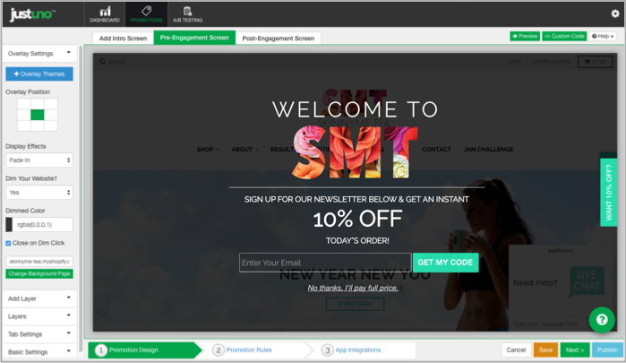
And here is a JustUno popup in action…
How to setup popups using LeadBoxes (by LeadPages)
So if you’re ready to install popups on your site I’ve just given you 10 pretty awesome choices to do so…
I choose to use LeadBoxes which is one of the functionalities of LeadPages.
I find LeadPages a great option because it’s reasonably priced, it allows me to easily use content upgrades and popups, PLUS its main purpose is actually to create pages for your site. Things such as sales pages, squeeze pages and product pages are super easy with this platform.
But for now, let’s focus on creating the two popups I discussed in the introduction: on arrival popups and exit-intent popups.
If you don’t have a LeadPages account the first thing you’ll need to do is sign up.
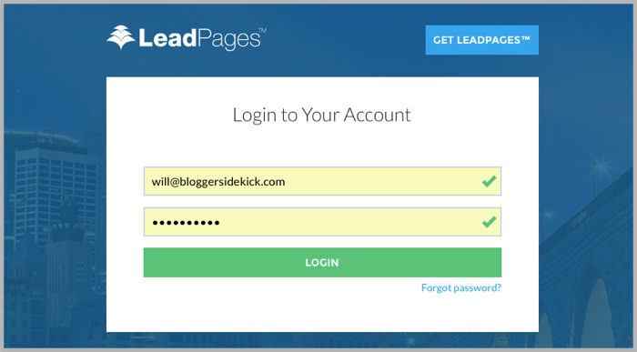
Step 1 – Login to LeadPages
If you are signed up, go to LeadPages and login.
Step 2 – Integrate with your email list
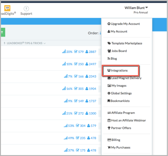
Before you can start creating your popups you’ll need to integrate your LeadPages account with your email list.
You can find the integrations section in the top right menu by clicking your name.
Step 3 – Navigate to LeadBoxes
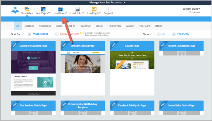
Once you are logged into your LeadPages account and have integrated your email list, navigate to the LeadBoxes section.
Step 4 – Create a new LeadBox
Click on the “Create A New LeadBox” button at the top of this section.
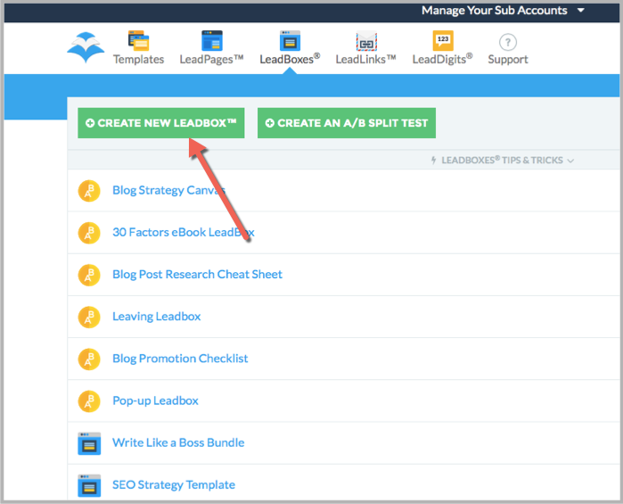
When you click this button a popup will come up on the screen asking for your “Industry”. Pick the most relevant one and then hit “Save and Continue”.
Step 5 – Pick the appropriate email list
Choose the list you want your new subscribers to go into from the form in the left hand side menu, and then hit “Customize this form”.
Note: You already integrated this list with your LeadPages account in “Step 2”.
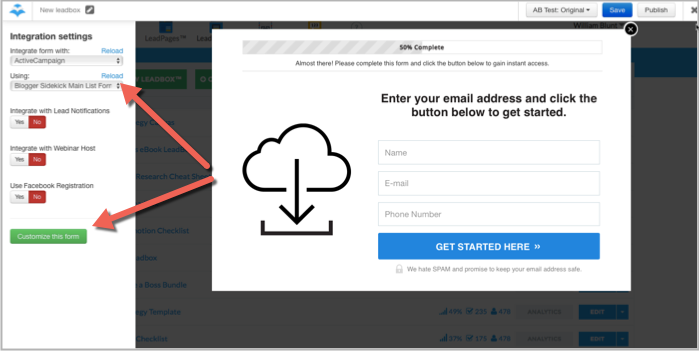
Step 6 – Personalize your LeadBox
Now it’s time to actually create your LeadBox (this is the popup your visitors will see).
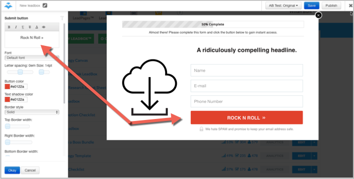
LeadPages makes this easy with their visual editor…
Just click on the elements you want to edit, and or delete, from your popup and edit them in the left hand side menu.
You’ll see I’ve done this below by changing the button color and text;
Step 7 – Setup a “Thank You” page
If someone decides to enter their details into your popup, what happens next?
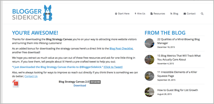
You need to send them to a “Thank You” page that tells them the next steps based on whatever you promised in your call-to-action.
LeadPages already has a default thank you page setup, but I recommend personalizing this step by sending them to another page on your site.
Firstly, create a page on your site that you want to send them to.
Here’s an example “Thank You” page from Blogger Sidekick;
Once you’ve got your thank you page ready to go, go back to the LeadBoxes screen so we can add this page in.
In the left hand menu of the visual editor you will see a “Thank you page” option;
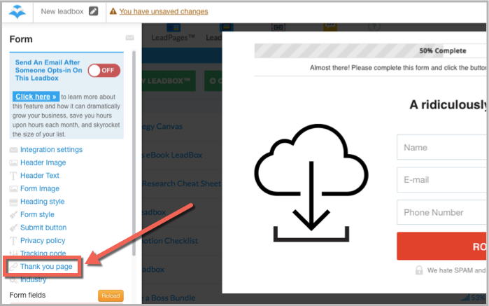
Drop the URL of your newly created page in the space provided and hit ok.
Step 8 – Publish your LeadBox
Once you are happy with the design of your popup and have appropriately integrated it with your email list and thank you page, hit publish.
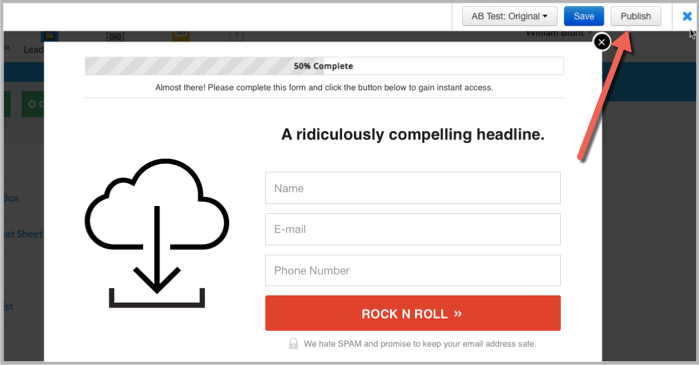
Step 9 – Program your popups
Sweet we’re almost done.
Once you hit that publish button, a popup will come up on your screen with a few options for how you’d like to publish your LeadBox.
The two sections we are interested in for the purpose of this process are the “Popup LeadBox” (this is the on-arrival popup) and “Exit LeadBox” sections.
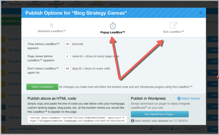
In these sections you will be able to choose the settings for how each of the boxes appear to your website visitors.
In the above example for the “Popup LeadBox” you can see this specific popup will appear once a visitor has viewed at least 2 pages and has been on the page for 30 seconds. Once they see the popup it won’t show again for 60 days.
Click the green “Save Changes” button once you are happy with your settings.
Step 10 – Integrate LeadBoxes with your website
There are two ways you can integrate LeadBoxes with your website…
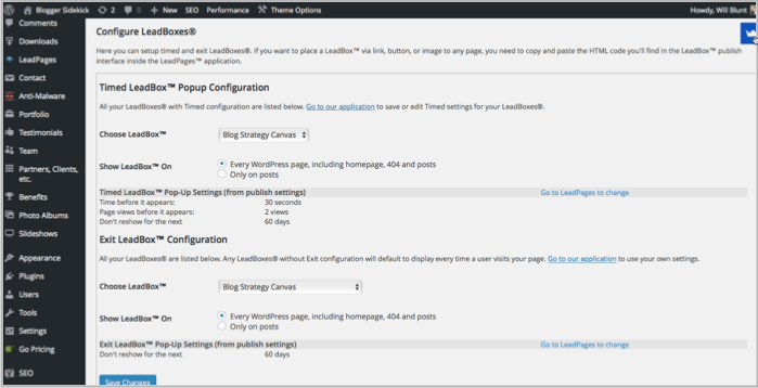
You can use the HTML code in the bottom left corner of this screen, OR if you have a WordPress site you can simply install the WordPress plugin on the bottom right of the screen.
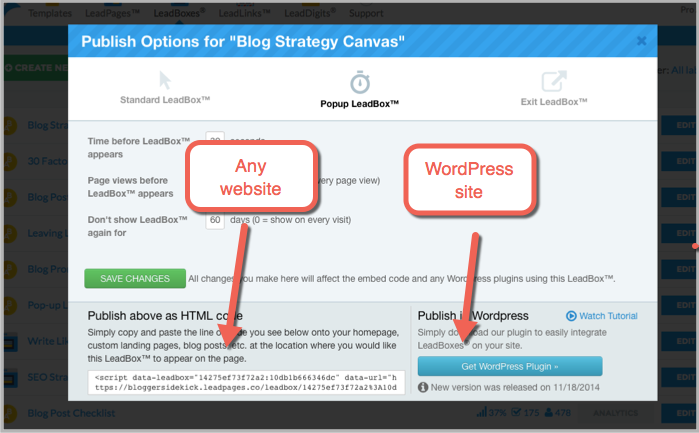
Here is what the popup WordPress plugin looks like under the hood;
BONUS Step – Running A/B split tests
This step isn’t necessary if you’re just getting popups setup for the first time, but it’s a pretty cool feature of LeadPages that will help improve your conversions over time.
In the visual editor, you can easily create multiple versions of your popup to test what works best.
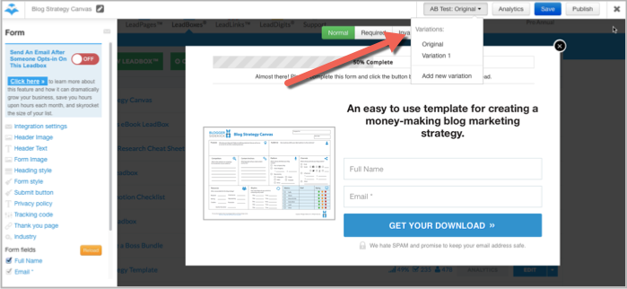
You can test things such as headline text, images, call-to-action text and button colors.
LeadPages has analytics for each individual popup you create which makes A/B split testing much more accurate.
Here is an example of a split test I ran with different button colors;
What’s your take on popups?
Which of these options have you used, and what would you recommend?

